Physio Clinic Website Mistakes to Avoid (And How to Fix Each One)
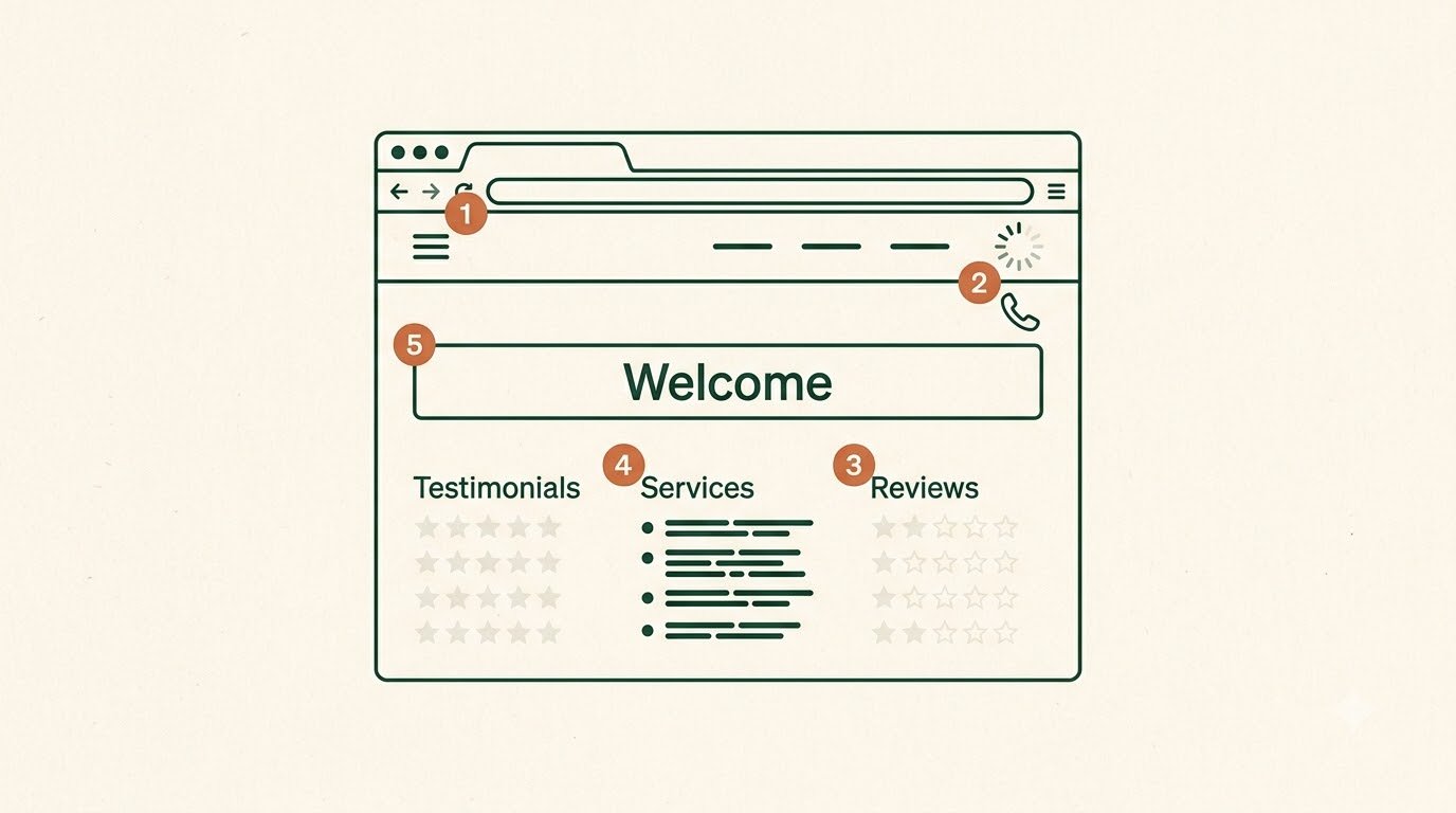
Quick answer: Most physiotherapy clinic websites do not fail because of one big problem. They fail because of a handful of small, common mistakes that quietly cost patients: a booking button nobody can find, a site that crawls on mobile, no reviews, a generic services list, and content that says nothing a patient was actually searching for. This guide walks through the mistakes we see most often, why each one matters, and exactly how to fix it.
Here is the uncomfortable truth about most physiotherapy websites. They are not bad because the clinic is bad. They are bad because the site was built once, launched, and never really looked at again through a patient’s eyes. The result is a website that looks perfectly fine to the owner and quietly turns away the patients it was supposed to bring in.
The good news is that these mistakes are common, which means they are well understood and mostly straightforward to fix. Below are the ones worth checking your own site against. Work through them in order, and be honest with yourself about each.
Mistake 1: Hiding the Booking Button
This is the most common and most costly mistake of all. A patient lands on your site ready to book, and then has to hunt for how to actually do it. The booking option is buried in a menu, or sat on a separate contact page, or written as a small text link rather than an obvious button.
Every extra click between a motivated patient and a booked appointment is a chance for them to give up and go back to Google. People in pain are not patient. If booking is not obvious, they leave.
How to fix it: Put a clear booking button in the top right of every page, and again at the end of every page. Make it a proper button, in a colour that stands out from everything else on the site, with plain wording like “Book an appointment.” The single most useful test is this: open your own homepage on your phone and time how long it takes to find the way to book. If it takes more than a few seconds, a new patient with less patience than you will not find it at all.
Mistake 2: A Website That Is Slow or Awkward on Mobile
Most patients will find you on their phone, often at the exact moment they are uncomfortable and looking for help quickly. If your site is slow to load, or clearly designed for a desktop and fiddly to use with a thumb, you lose these patients before they even see what you offer.
A meaningful share of mobile visitors leave a page that takes too long to load, and they rarely come back. A site that was built desktop-first and squeezed onto a phone as an afterthought feels clumsy, and patients read that clumsiness as a sign of a clinic that is behind the times.
How to fix it: Your site needs to be genuinely mobile-first, not a desktop layout shrunk down. Pages should load quickly, buttons should be easy to tap, and booking should work smoothly on a phone without endless typing. We cover what this actually means for a clinic, including one form field that quietly costs bookings, in our mobile-first design guide.
Mistake 3: No Reviews, or Reviews From Three Years Ago
Patients choosing a physiotherapist are making a health decision, and they look for reassurance before they book. Reviews are that reassurance. A clinic with no reviews, or with reviews that all date from years ago, gives a hesitant patient nothing to hold on to. Worse, it quietly signals that the clinic might not be very active.
Reviews are not just a trust signal for patients. They are also a ranking signal for Google, which favours clinics with a steady stream of recent, genuine reviews. So old or missing reviews hurt you twice: patients trust you less, and you show up lower in local search.
How to fix it: Ask every satisfied patient for a review, directly, after their appointment. Make it easy with a direct link to your Google review page, sent by text or email the same day. Reply to every review you get, positive or negative. You do not need hundreds. A steady trickle of recent, specific reviews does more than a big pile of old ones. Consistency is what matters.
Mistake 4: A Single Generic “Services” Page
The weakest content pattern on a physiotherapy website is one page titled “Our Services” with a bare bulleted list: sports injuries, back pain, post-surgery rehabilitation, each a single line with nothing behind it. It tells a patient almost nothing, and it gives Google almost nothing to work with either.
A patient searching for help with a specific problem, like a torn ACL or persistent lower back pain, wants to know that you understand their particular issue. A one-line mention in a list does not convince them. And because the page is thin, it struggles to rank for any of those specific searches.
How to fix it: Give each significant condition or service its own dedicated page, written in the language a patient would actually use. Cover what the condition is, what treatment usually involves, what a first session looks like, and roughly what recovery involves. This is better for patients and much stronger for search. You can see the difference this makes, laid out side by side, in our guide on what separates a good physiotherapy website from a bad one.
Mistake 5: A Vague Homepage That Says Nothing Specific
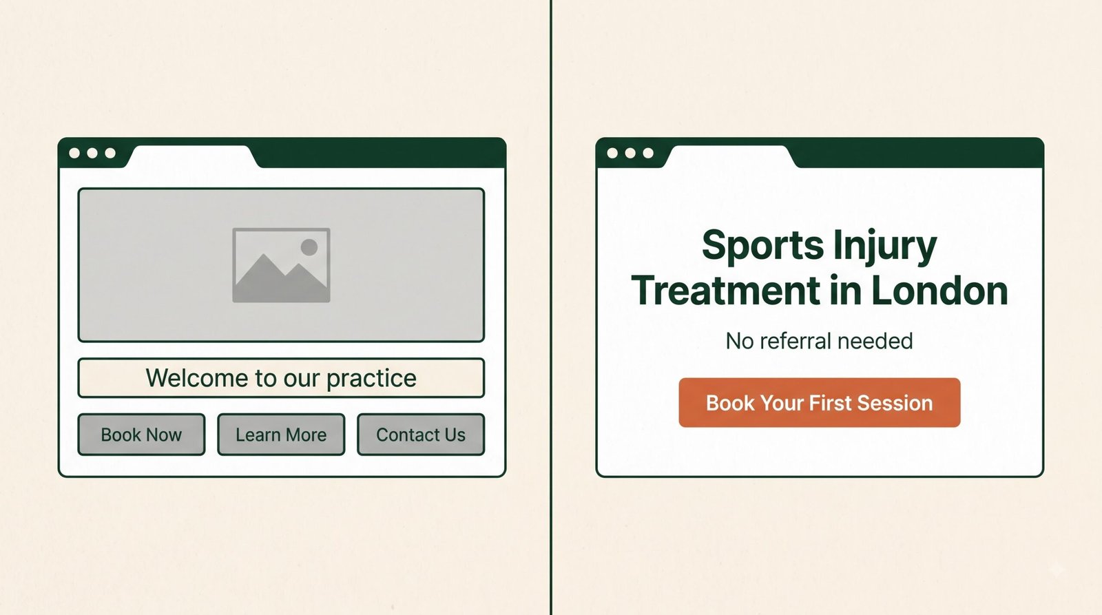
Many clinic homepages open with a large photo and a soft, generic line like “Welcome to our practice” or “Your journey to wellness starts here.” It looks pleasant and communicates nothing. A visitor still does not know what you treat, who you help, or why they should choose you.
The first screen a visitor sees, before they scroll at all, does more work than any other part of the site. If it does not quickly answer what you treat and who you treat it for, most visitors will not stick around to find out.
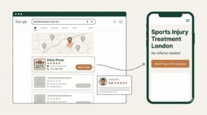
How to fix it: Replace the vague welcome with a specific statement of what you do and who for. Something like “Sports injury and back pain treatment in [your town]. No referral needed.” A patient should understand within seconds that they are in the right place. Specific beats warm-but-empty every time.
Mistake 6: Being Invisible in Local Search
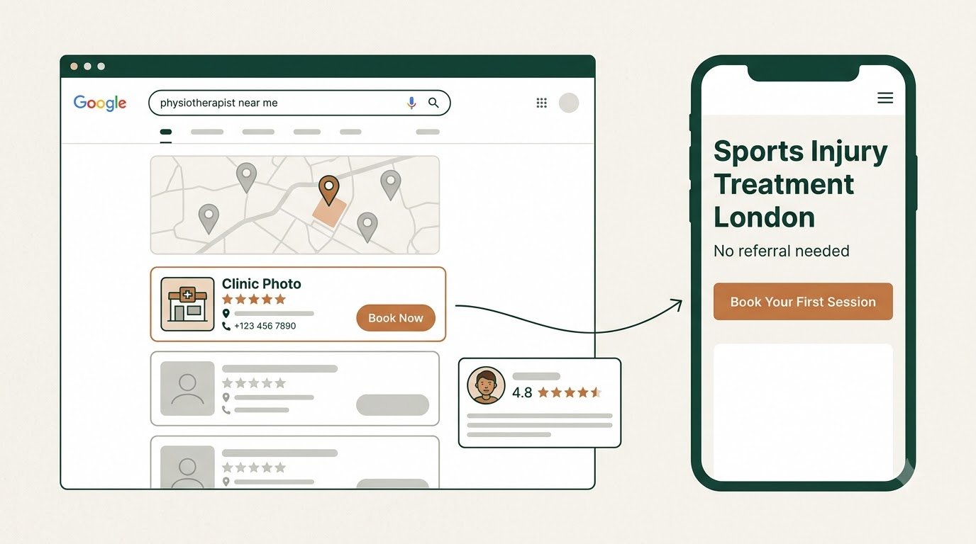
A physiotherapy clinic lives or dies on local visibility. When someone nearby searches “physiotherapist near me” or “physio in [your town],” you either show up in the local results or you do not. A surprising number of clinics have never properly set up the things that make them appear there, and simply stay invisible to patients who are actively looking.
The most common version of this mistake is an incomplete or neglected Google Business Profile: missing photos, no opening hours, an out-of-date address, no recent posts, and reviews left unanswered. Google reads all of that as a clinic that is not really paying attention, and ranks it accordingly.
How to fix it: Claim and fully complete your Google Business Profile, with real photos, accurate information, and your correct opening hours. Keep it active, and make sure your name, address, and phone number match everywhere they appear online. Our local SEO guide for UK physiotherapy clinics covers the free fix most clinics have not touched in months.
Mistake 7: Hiding Your Prices
A lot of UK clinics deliberately keep their prices off the website, hoping to get the enquiry first and quote later. In practice this tends to backfire. Patients trust clinics that are upfront, and a total absence of pricing often puts off serious patients who simply want to know what they are committing to before they pick up the phone.
Vague pricing rarely filters out as many time-wasters as owners expect. What it more reliably does is add friction for the genuine patients who are ready to book but want to know the cost first.
How to fix it: Show your prices, or at least honest ranges. You do not have to list every possible treatment, but a patient should be able to find out roughly what an initial consultation and a typical session cost. Being upfront builds trust and removes a reason to hesitate.
Mistake 8: Letting the Site Go Stale
A website is not a “build it once and forget it” purchase. Left untouched, it slowly slips: the software falls behind, pages get slower, content goes out of date, and small things quietly break. A booking form stops sending emails after an update, a departed staff member is still listed a year later, last year’s prices are still showing. Each of these is a small trust leak, and together they add up.
The danger is that none of this is dramatic. There is no alarm. The site just gradually gets worse until a patient notices, or until you look at your enquiry numbers and wonder where they went.
How to fix it: Treat your website as something that needs regular upkeep, not a one-off project. Keep the software updated, the content current, the forms tested, and an eye on performance and search visibility. We explain why this matters, and what good ongoing care looks like, in why physio clinics need monthly website care.
Mistake 9: No Clear Next Step After an Enquiry
A patient fills in your contact form or sends an enquiry, and then hears nothing, or has no idea what happens next. No confirmation, no sense of when they will hear back, no reassurance that their message even arrived. This uncertainty is enough to send them straight to a competitor while they wait.
How to fix it: Make sure every enquiry gets an immediate acknowledgement, even an automated one, that confirms the message arrived and says when they can expect a reply. On the page itself, set expectations clearly: tell people what happens after they get in touch. A little reassurance at this moment keeps a patient from second-guessing and looking elsewhere.
Mistake 10: Building for Yourself Instead of the Patient
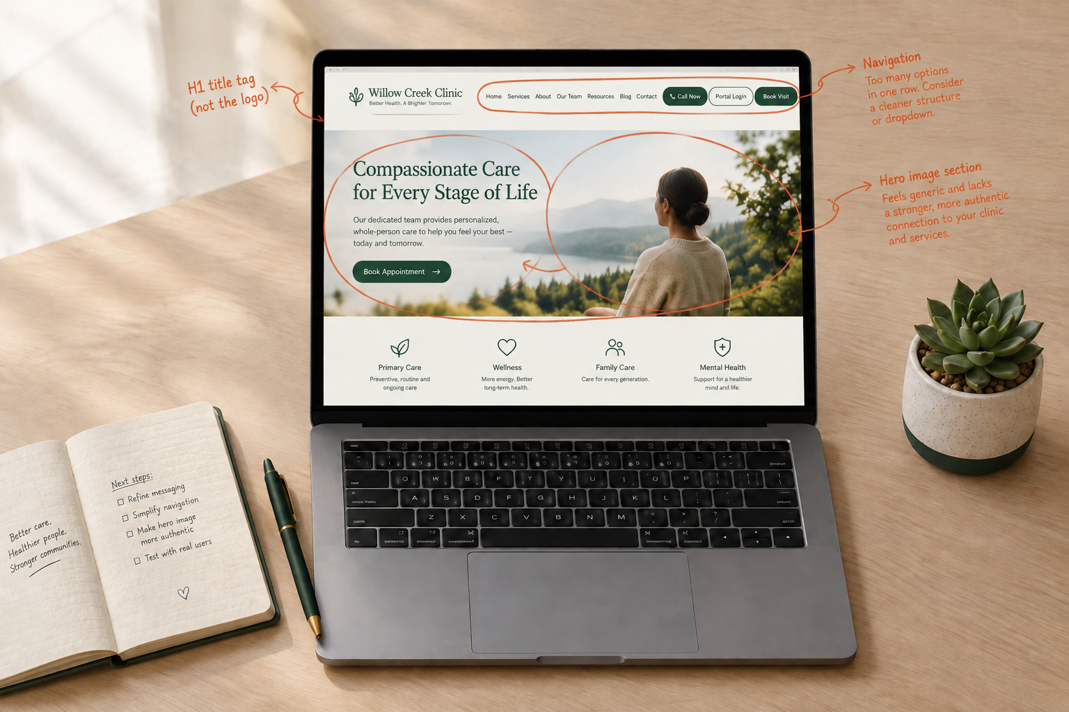
This is the mistake underneath many of the others. Clinic owners naturally think about their website from their own point of view: their story, their qualifications, their history, their equipment. All of that has a place, but it is not what a patient leads with. A patient arrives worried about their own problem, and wants to know quickly that you can help with it.
A site that opens by talking at length about the clinic, before it ever addresses the patient’s actual concern, misses the moment. The visitor came in with a question about themselves, and the site answered with a paragraph about you.
How to fix it: Lead with the patient. Open with what you treat and who you help, answer the questions they arrive with, and make booking easy. Your story and credentials still matter, and they build trust, but they work best once you have first shown the patient they are in the right place. If you are weighing up a rebuild, our physiotherapy website design guide walks through how to structure a site around the patient rather than the clinic.
How Many of These Does Your Site Have?
Very few clinic websites are free of all ten. Most have three or four, quietly costing patients without the owner ever realising. The point of this list is not to be disheartening. It is that every one of these is fixable, and fixing even a couple of them can make a real difference to how many enquiries your site brings in.
If you want a structured way to check your own site against these and other fundamentals, our free physiotherapy website checklist walks through them in more detail so you can see exactly where you stand.
For most clinics, a hidden or hard-to-find booking button, closely followed by poor mobile performance. Both directly lose patients who were ready to book. If you only fix two things, fix those first.
Several you can fix yourself. Rewriting a vague homepage headline, showing your prices, asking patients for reviews, and completing your Google Business Profile are all within reach without touching any code. The more technical fixes, like proper mobile performance and detailed condition pages built to rank, usually benefit from some expertise.
Open it on your own phone, on mobile data rather than wifi, and see how it feels. If it takes more than a few seconds to become usable, or if it feels sluggish and awkward to tap around, patients are experiencing the same thing and some are leaving.
In most cases, yes, and the fact that competitors hide theirs can work in your favour. A patient comparing two clinics will often lean towards the one that was open about cost, because it feels more trustworthy and saves them the awkwardness of asking.
Not necessarily. A polished, expensive-looking site with a buried booking button, no reviews, and a vague homepage will often underperform a plainer site that gets the fundamentals right. Looks help once the basics work. They rarely rescue a site that gets the basics wrong.
If you want a clear view of where your own site stands against these five principles, our free physiotherapy website checklist covers them in more detail, and our website design guide is the right next read if you are considering a rebuild.