Physiotherapy Website Examples: What Actually Separates a Good One from a Bad One
Quick answer: Rather than screenshot specific clinics, since a website changes the moment someone redesigns it and public commentary on named competitors rarely ages well, this guide breaks down the actual patterns that separate a physiotherapy website that converts from one that does not. Every principle here is illustrated, not just described, so you can hold it up against your own site and see exactly where it stands.
Most “website inspiration” articles are a gallery of screenshots with a caption underneath each one. The problem is that a screenshot tells you what a site looked like on the day it was captured, not why it works, and it goes stale the moment that clinic redesigns. What actually helps is understanding the underlying pattern well enough to recognise it anywhere, including on your own site.
This guide covers what genuinely separates a strong physiotherapy website from a weak one, based on established web conversion research and what we have seen work across the clinics we build for.
What Makes a Homepage Hero Actually Work
The hero, the section a visitor sees before scrolling at all, carries more weight than almost anything else on the page. Research from the Nielsen Norman Group has consistently found that users spend the majority of their attention above the fold, sometimes estimated as high as 80% of total viewing time on a page. If your value proposition and your booking button are not visible in that first screen, most visitors never see them at all.
A hero that works does three things, and does them without competing for attention:
- States clearly, in the first sentence, what you treat and who you treat it for
- Shows a single, obvious next step, not three buttons of equal visual weight
- Loads fast enough that the visitor sees it within about three seconds, since anything slower starts losing people before the hero even finishes rendering
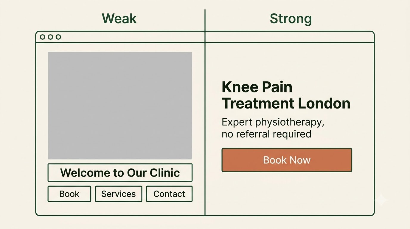
A hero that fails usually does the opposite: a vague headline like “Welcome to our clinic,” a large decorative image with no clear message, and several competing buttons that leave a visitor unsure which one actually matters.
The CTA Placement Pattern Almost Every Good Site Follows
Conversion research consistently finds that pages with a call to action at multiple points, not just one, tend to outperform pages that only ask once. The pattern that works is not “more buttons everywhere.” It is one clear primary action repeated at the moments a visitor is actually ready to act.
- Above the fold, for the visitor who already knows they want to book and is just looking for the button
- After you have said something convincing, a results section, a specific service description, a genuine testimonial, for the visitor who needed a reason first
- At the very end of the page, for the visitor who read everything and is only now ready
The mistake most clinic websites make is not having too few calls to action. It is having several different ones, worded differently, competing with each other, so nothing reads as the obvious next step.
Good Trust Signals vs Decorative Ones
Almost every physiotherapy website has some version of a trust section, reviews, qualifications, years in practice. The difference between one that actually builds trust and one that reads as decoration comes down to specificity.
A decorative trust signal says “fully qualified and experienced.” A real one says “HCPC registered, twelve years treating sports injuries, MSc in Sports Physiotherapy.” A decorative review section shows three quotes with no names attached. A real one shows recent, dated reviews with a first name and what the patient was actually treated for.
Specificity is what makes a trust signal do its job. Vague claims are easy to write and easy to ignore. Specific ones are harder to write and much harder to scroll past without registering them.
Service Pages: Generic List vs Actually Useful
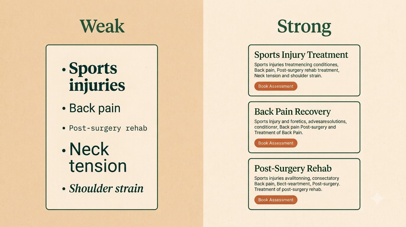
The weakest pattern on a physiotherapy website is a single “Our Services” page listing conditions as a bare list with no detail, sports injuries, back pain, post-surgery rehabilitation, each one a single line with nothing behind it.
The stronger pattern gives each significant condition or service its own page, written in the language a patient searching for it would actually use, covering what the condition is, what treatment typically involves, and what a first session looks like. This is not just a conversion improvement. It is also directly tied to how well a page can rank in search, since a generic list has almost nothing for Google or an AI assistant to extract and cite, while a proper page does.
What a Weak Physiotherapy Website Actually Looks Like
Rather than naming real clinics, it is more useful to describe the pattern, since almost every underperforming clinic website shares some combination of the same handful of problems:
- A homepage that opens with a large photo and a generic tagline, with no clear statement of who the clinic actually helps
- A booking action buried in a dropdown menu or on a separate contact page, rather than visible on every page
- A single generic services list instead of individual, detailed pages
- Reviews that are either missing entirely or several years old
- A layout clearly designed for a desktop screen first, uncomfortable to use on a phone
- No indication of what happens next after someone submits an enquiry
None of these are unusual. They are the default outcome of a website built once, launched, and never revisited, which describes a large share of clinic websites currently live.
Two Patterns, Side by Side
The clearest way to see the difference is to hold the weak and strong versions of the same section next to each other, with nothing else about the clinic changed.
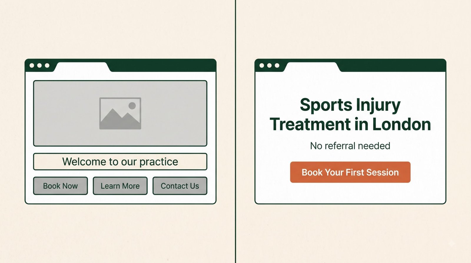
The hero section. The weak version opens with a large, decorative photograph and a tagline like “Welcome to our practice,” giving a visitor nothing to act on and no clear next step. The strong version opens with a specific statement of who you treat, a single unmistakable booking button, and a supporting line that removes hesitation, something like confirming no referral is needed. Nothing else on the page matters if this first screen fails to earn a second one.
The service page. The weak version is a single line in a bulleted list, “sports injuries,” sitting alongside a dozen other conditions with no further detail anywhere on the site. The strong version gives that same condition its own page: what it is, how treatment typically progresses, what a first session involves, and a booking action at the bottom. The weak version gives a search engine and a hesitant visitor nothing to work with. The strong version gives both exactly what they came looking for.
How PhysioWebCare Approaches This
Every website we build starts from these patterns as a baseline, not an afterthought layered on at the end. You can see the fuller design process in our physiotherapy website design guide, and check where your own current site stands using our free website checklist.
Frequently Asked Questions
Why doesn’t this guide show real physiotherapy clinic websites as examples?
A screenshot only shows what a site looked like on the day it was captured, and public commentary on a specific business’s live website rarely stays fair or accurate for long, since sites get redesigned. The underlying patterns in this guide apply regardless of which clinic you look at, and they stay useful long after any individual screenshot would have gone out of date.
How much of this can I realistically fix myself?
More than most clinic owners assume. Rewriting a vague hero headline, moving your booking button somewhere more visible, and adding a couple of detailed service pages are all changes you can make without touching the site’s underlying code. The technical work, like proper mobile performance and structured data, usually needs more specific expertise.
Is a highly polished, expensive-looking website always the better performer?
Not necessarily. A visually striking site with a buried booking button and no clear value proposition will often underperform a plainer site that gets the fundamentals right. Polish helps once the underlying structure already works. It rarely rescues a page that gets the basics wrong.
How do I know if my own hero section is working?
Open your homepage on a phone, and time how long it takes you to find the answer to two questions: what does this clinic treat, and how do I book. If either takes more than a few seconds to find, a new visitor with less patience than you is likely to leave before finding it either.
If you want to see exactly where your own site currently stands against these patterns, our free website checklist covers the fundamentals in this guide in more detail, and our website design guide is the right next read if you are considering a rebuild.