
Mobile-First Website Design for UK Physiotherapy Clinics: The Complete 2026 Guide
Quick answer: More than half of all website visits now happen on a phone, and a physio clinic’s visitors are more mobile-heavy still, since most are searching in the moment they feel pain, not sitting at a desk. Google has confirmed that over half of mobile visitors abandon a page that takes longer than three seconds to load, and mobile sites consistently pass Google’s own performance benchmarks at a meaningfully lower rate than desktop sites. Designing mobile-first is not a stylistic preference anymore. It is the difference between a visitor booking and a visitor leaving.
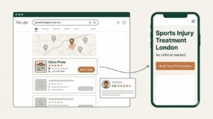
A patient with a stiff shoulder does not sit down at a laptop to look for help. They pull out their phone, mid-morning, one-handed, often while still slightly uncomfortable, and search for a physio right then. If your website was designed on a large desktop monitor and only checked on mobile as an afterthought, that exact moment is where you lose them.
This guide covers what mobile-first actually means in practice for a physiotherapy clinic website, grounded in current performance data, not general web design opinion.
How Much of Your Traffic Is Actually Mobile?
Globally, mobile devices now account for more than half of all website traffic, and for a local service business like a physiotherapy clinic, that share tends to run higher still. Patients searching “physio near me” are, by definition, out and about or reaching for their phone in the moment, not planning ahead on a desktop computer.
This matters because Google has indexed and ranked the mobile version of your site as the primary version for years now, not the desktop version. If your mobile experience is the weaker of the two, that weaker version is the one deciding your search visibility, not just your conversion rate.
The Three Second Rule, and Why Physio Patients Are Especially Impatient
Google’s own research has found that just over half of mobile visits are abandoned once a page takes more than three seconds to load. This figure is one of the more consistently repeated findings across current web performance research, and it holds up because the underlying behaviour is intuitive: nobody waiting on a slow-loading page while standing in a car park is feeling patient.
For a physiotherapy clinic specifically, this abandonment risk is arguably worse than average. A visitor in discomfort has a lower tolerance for friction than someone browsing casually. A slow page does not just cost you a visitor. It costs you a visitor who was actively motivated to book, at the exact moment they were ready to.
What Google’s Core Web Vitals Actually Measure
Core Web Vitals are the specific metrics Google uses to judge whether a page provides a genuinely good experience, and they became a more heavily weighted ranking factor following Google’s most recent core update. Stripped of jargon, they measure three things:
- Loading speed, specifically how long it takes for the main content of a page to visibly appear, not just for the page to technically start loading
- Responsiveness, how quickly a page reacts when someone actually taps something, a button, a menu, a form field
- Visual stability, whether content jumps around as a page finishes loading, which is the frustrating experience of trying to tap a button that shifts position right as you touch it
Independent measurement of real websites consistently finds that mobile pages pass all three of these benchmarks at a noticeably lower rate than desktop pages, often somewhere in the range of 40 to 50% for mobile against 55 to 65% for desktop, depending on which dataset you look at. The exact percentage varies by source, but the pattern is completely consistent. Mobile is where most sites are quietly underperforming.
Why Most Clinic Websites Fail on Mobile Specifically
Mobile problems tend to cluster around a small number of repeat offenders, not a long list of obscure technical issues.
- Images sized for desktop, loaded at full resolution on a phone that will only ever display them at a fraction of that size, adding seconds of unnecessary load time
- Navigation menus built for a mouse hovering over dropdowns, which do not translate cleanly to a thumb tapping a small screen
- Text sized for a 24-inch monitor, which becomes uncomfortably small or forces constant pinch-zooming on a phone
- Forms designed for a keyboard and a mouse, with small fields and tiny submit buttons that are genuinely difficult to use accurately with a thumb
- Pop-ups and overlays that behave acceptably on desktop but cover the entire screen on mobile, sometimes with a close button that is nearly impossible to tap precisely
None of these require a complete rebuild to fix. Most are configuration and content decisions rather than deep technical work.
Designing for Thumbs, Not Just Screens
Mobile-first design means starting from how someone actually holds and uses a phone, not shrinking a desktop layout down until it technically fits.
Research into mobile usage patterns suggests roughly half of users primarily browse with one thumb, which means the most important actions on your site, booking, calling, finding your address, should sit within comfortable thumb reach, generally the lower half of the screen, rather than requiring a stretch to the top corner.
A few concrete implications for a clinic site:
- Put your booking button somewhere a thumb naturally rests, not just visually prominent at the very top of the page
- Make tap targets genuinely large enough to hit reliably, a button that looks fine on desktop can be frustratingly small to tap accurately on a phone
- Keep navigation simple enough that a visitor can find what they need within the first ten to fifteen seconds, since patience for hunting through menus is low on mobile specifically

The Booking Form Problem
If there is one single element worth obsessing over on mobile, it is your booking or enquiry form. This is the exact point where a motivated visitor either becomes a patient or gives up.
Long forms with many fields perform worse on mobile than on desktop, simply because typing on a phone keyboard is slower and more error-prone than typing on a physical one. Every field you can remove is a small reduction in the chance someone abandons partway through. Ask for what you genuinely need to book a first appointment, and leave the rest for the conversation that follows.
A Practical Mobile Checklist
- Test your actual site on an actual phone, not just a resized browser window on a desktop screen
- Check your Core Web Vitals in Google Search Console specifically for the mobile report, not just the overall summary
- Confirm your booking button is reachable and clearly visible without scrolling on a typical phone screen
- Time how long your homepage takes to visibly load on a standard mobile connection, not office wifi
- Reduce your booking form to the fewest fields that still let you follow up properly
- Check that any pop-up or cookie banner does not block the entire screen or trap a visitor with a tiny close button
This overlaps with several items in our free website checklist, which is worth running through if you have not audited your site recently.
How PhysioWebCare Approaches This
Every website we build starts from the mobile layout first, not as an adaptation of a desktop design afterward. Booking, navigation, and page speed are all designed around how a patient actually uses a phone, since that is genuinely where most of your visitors are. You can read more about our overall approach in our website design guide.
Frequently Asked Questions
Yes, because the patients you have not met yet are the ones searching on their phone right now, deciding whether to call based entirely on what your website shows them in those first few seconds. A strong phone-booking culture does not replace the need for a website that works well on mobile, it depends on that website getting someone to pick up the phone in the first place.
Google’s own PageSpeed Insights tool, free to use, gives you a mobile-specific Core Web Vitals report for any URL. Google Search Console, if connected to your site, also shows a mobile-specific performance report over time rather than a single snapshot.
Not quite. A responsive design resizes a layout to fit different screens, which is necessary but not sufficient. Mobile-first design starts the entire design process from the mobile experience and builds outward, which tends to produce a genuinely better phone experience than a desktop design that has simply been made to technically fit a smaller screen.
Both. Google has used page experience, including Core Web Vitals, as a ranking factor for several years, and the mobile version of your site specifically is what Google primarily indexes and ranks. Improving mobile performance is one of the few changes that helps rankings and conversions at the same time.
The Google Business Profile basics are genuinely doable yourself with an hour or two of focused effort. Where it gets harder is maintaining it consistently, building location-specific website content properly, and knowing which signals actually matter for a healthcare-adjacent business specifically, which is where a lot of clinics end up either neglecting it over time or paying for expertise.
If you want a clear view of where your clinic currently stands, our free website checklist includes the exact local SEO items covered in this guide, and our Grow plan handles local SEO management on an ongoing basis so it never quietly slips, the way it does on most clinic websites left unmanaged.
If you are earlier in the process and still deciding on your website itself, our physiotherapy website design guide is the right place to start first.